Portugal Case Study

An immersive travel platform that inspires users to explore and book trips across Portugal, focusing on creating a visually engaging and structured experience that balances inspiration, clarity, and usability.

Problem: Many travel websites overload users with details but fail to inspire action.
The Goal: Design a visually engaging travel website that inspires exploration, simplifies decision-making, and encourages users to book trips.
Target Users: Young travelers, couples, solo travelers, and experience driven users. They need inspiration (where should I go?), trust (is it worth it?), and simplicity (how do I book fast?).

I structured the page to move users from emotional inspiration and exploration to actionable decisions.
Page Flow:
Hero → First impression, Inspiration and CTA
Destination highlight → Exploration
Visual section → Engagement
Stats → Social proof
Blog → Trust building
Events → Urgency
Footer → Conversion support
Homepage - Strong hero image of the ocean, clear navigation, immediate CTA.
Why it works - Simple but emotional with a clear entry point.
Unforgettable Adventure section - A map-inspired layout with cities users can visit.
Why it works - It reinforces the exploration theme and breaks standard grid layouts.
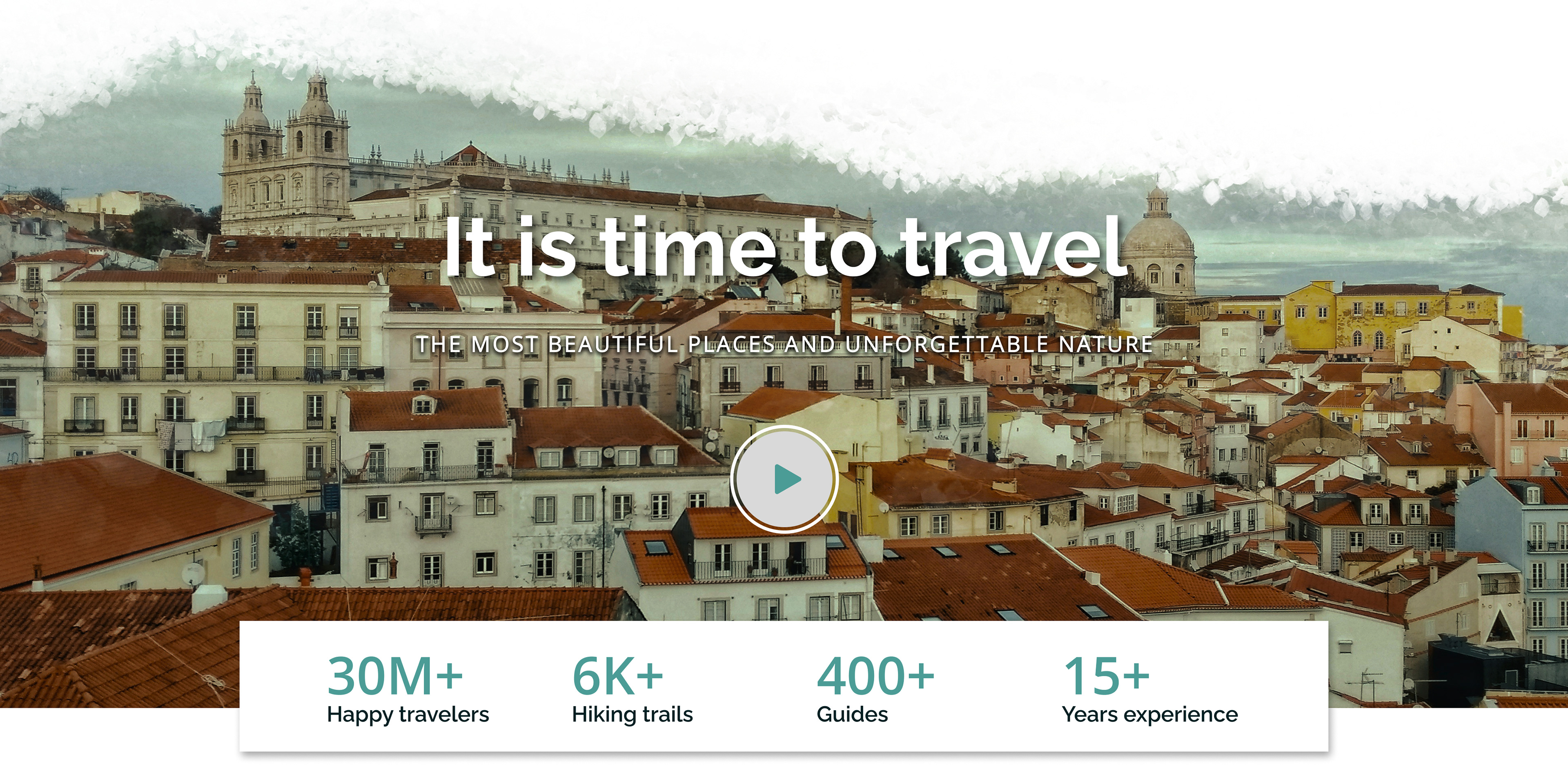
Travel Stats section - City visuals and a play button with eye-catching stats.
Why it works - Encourages interaction and builds brand trust, as well as reliability.
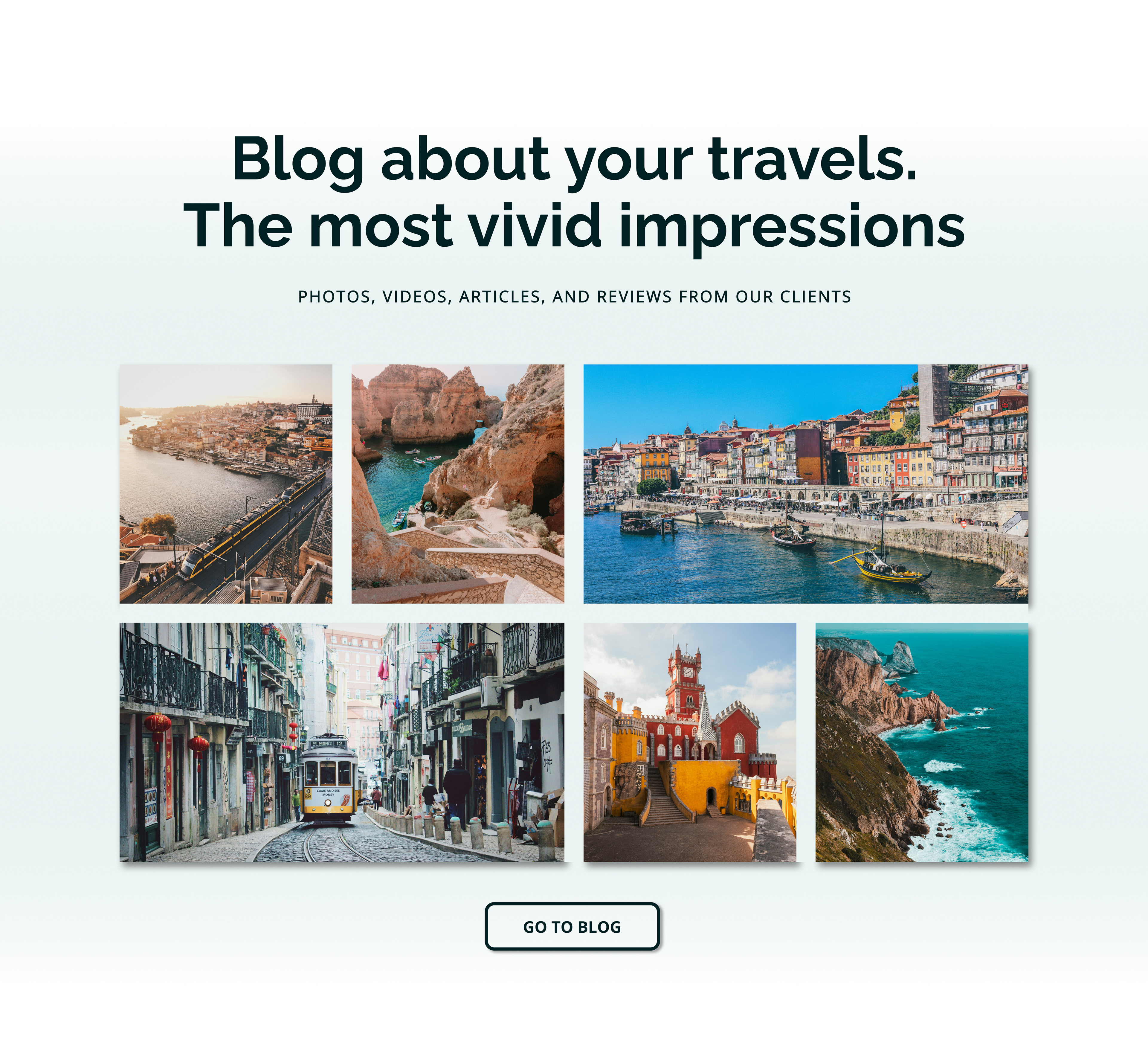
Blog section - Grid based content cards.
Why it works - Visually scannable with content-driven engagement.
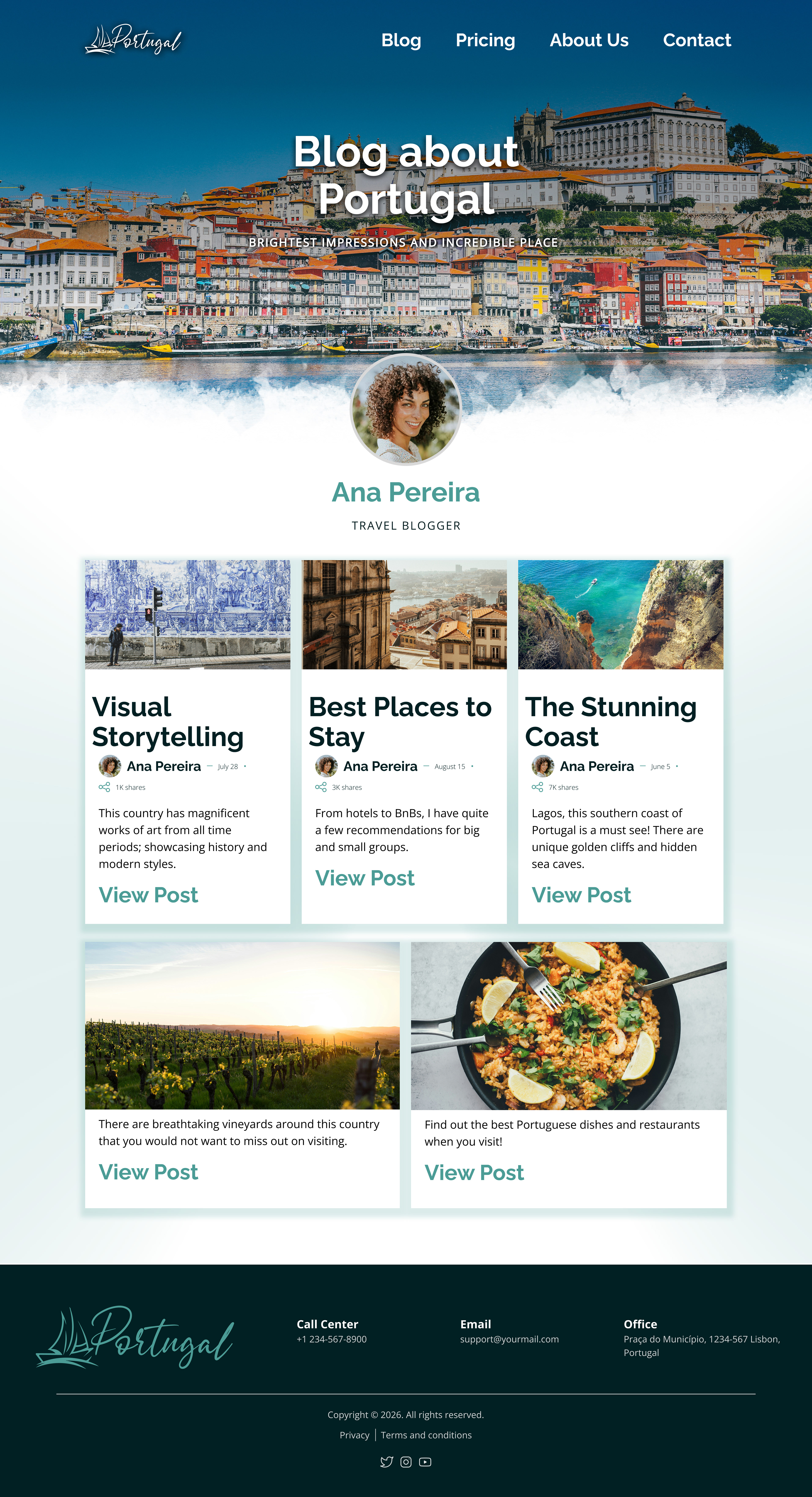
Blog Page - Showcases different blogs of ideas and places to experience in Portugal.
Why it works - Encourages more exploration and engagement.
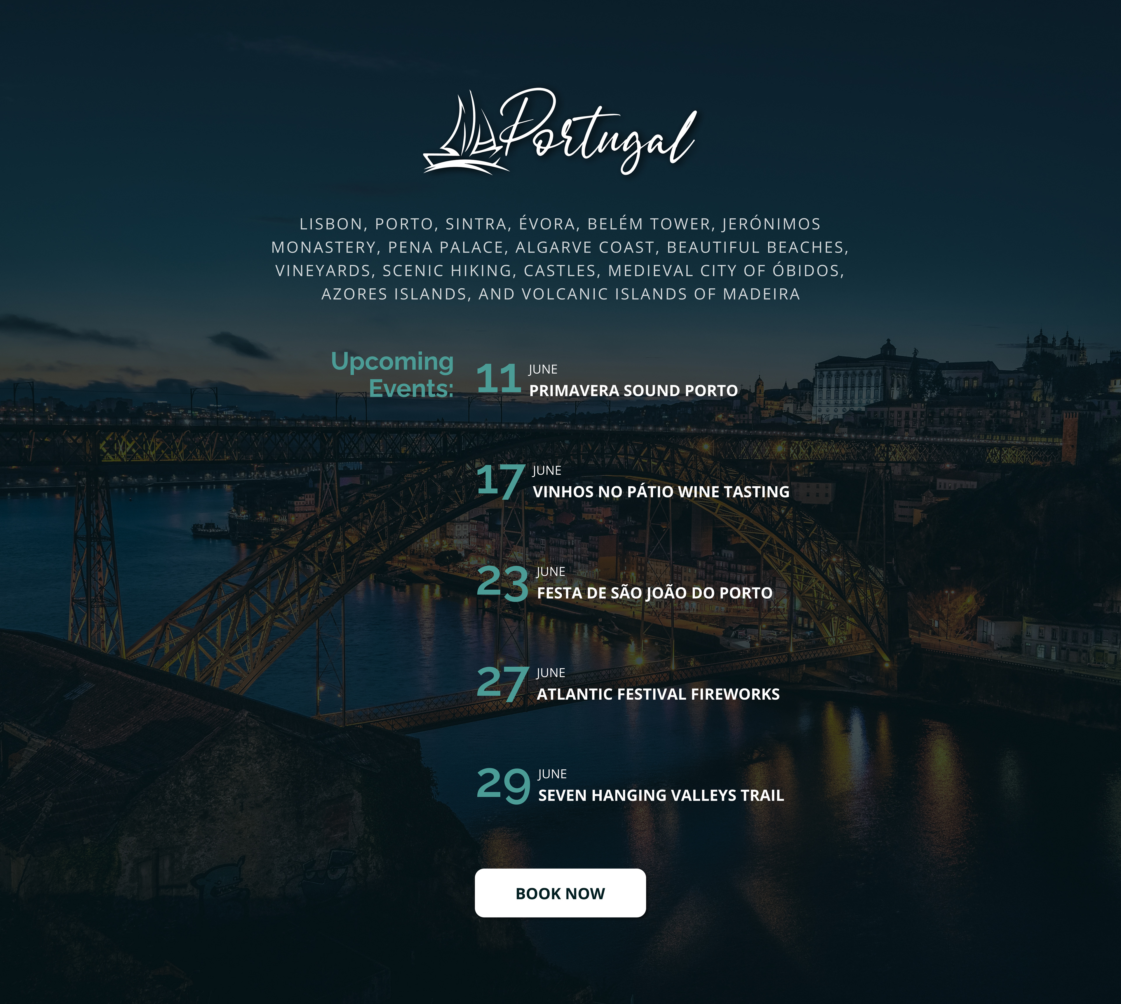
Events section - Timeline-style layout showcasing upcoming events.
Why it works - Creates urgency and encourages trip planning.
Mobile Experience - The design adapts to smaller screens by simplifying navigation and stacking content for clarity.
UI Design System
Colors: Deep teal and ocean tones for a calm, premium, travel vibe. I added a white background for clarity and readability.
Typography: Bold sans-serif for headlines and a clean body text for readability and balance.
Components: Buttons are rounded with soft shadows as well as the cards. Clean navigation bar with image-forward sections.

This project helped me transition from purely visual design as a graphic designer to user-focused UI thinking—considering not just how things look, but also how users navigate, decide, and engage with a product.
Copy/Paste Prototype Link Below:
https://www.figma.com/proto/gyOqaIP3MQIXvXFL477svj/Portfolio?node-id=17-130&viewport=-1507%2C66%2C0.25&t=SZGdsBUa8OEIGHp3-1&scaling=min-zoom&content-scaling=fixed&starting-point-node-id=17%3A130&page-id=0%3A1
