Homeplate Case Study

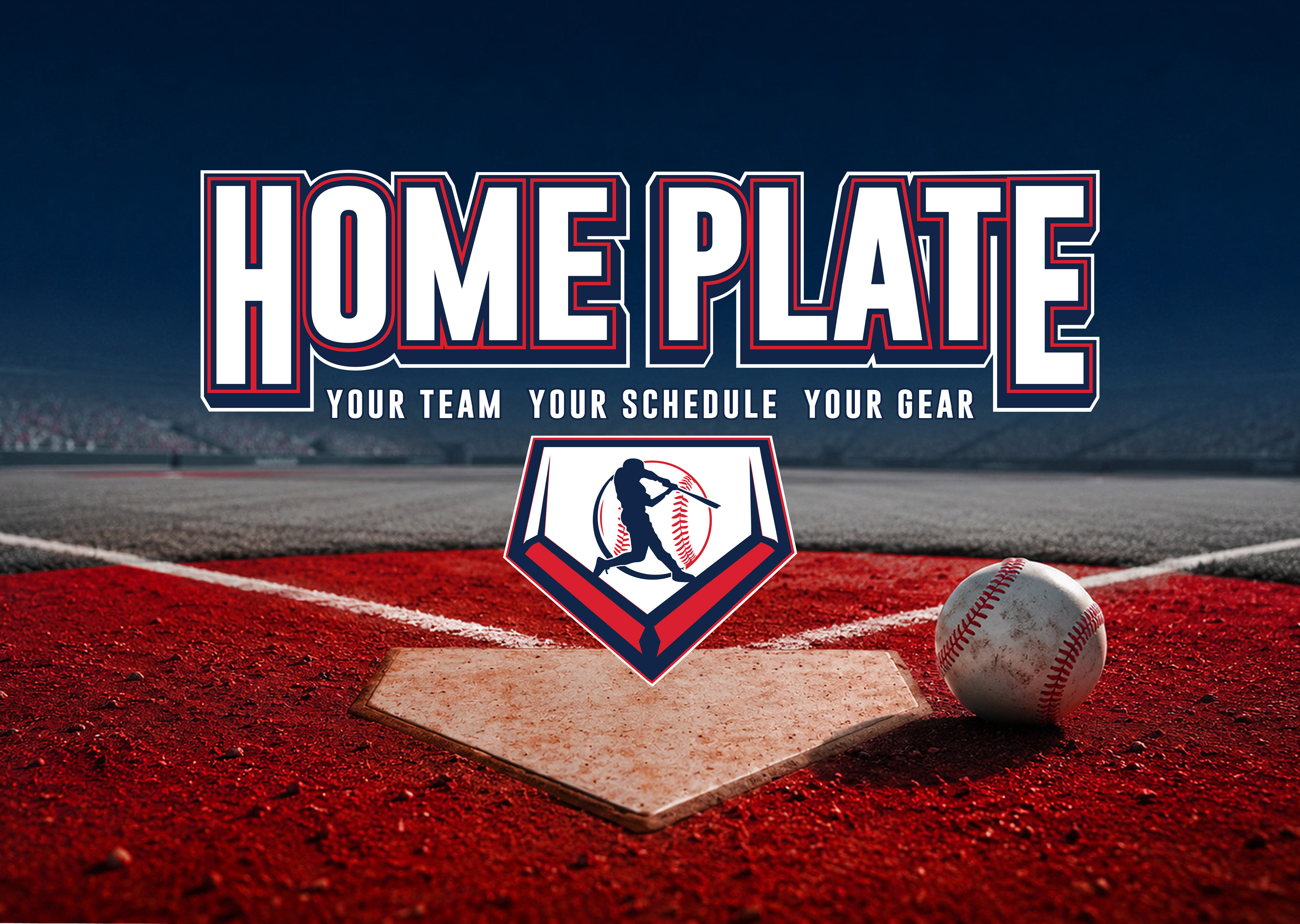
Homeplate is a centralized platform for a school baseball team that allows players, parents, and fans to easily view game schedules, track updates, and purchase team merchandise.

The Problem: School baseball teams often rely on multiple platforms for schedule updates. They also can have outdated websites with separate systems for merchandise sales. This leads to missed games or confusion about times and locations, poor fan engagement, and lost revenue from merch due to friction.
The Goal: Design a clean, user-friendly platform that centralizes game schedules, simplifies communication, and makes purchasing merchandise fast and appealing, working seamlessly across mobile and desktop.
Target Users: Players (14-18), parents, students and fans. Users would need quick access to game times and locations, an easy way to check last minute changes, a quick and simple merch purchasing experience, and mobile-first usability since most users check schedules on their phones.

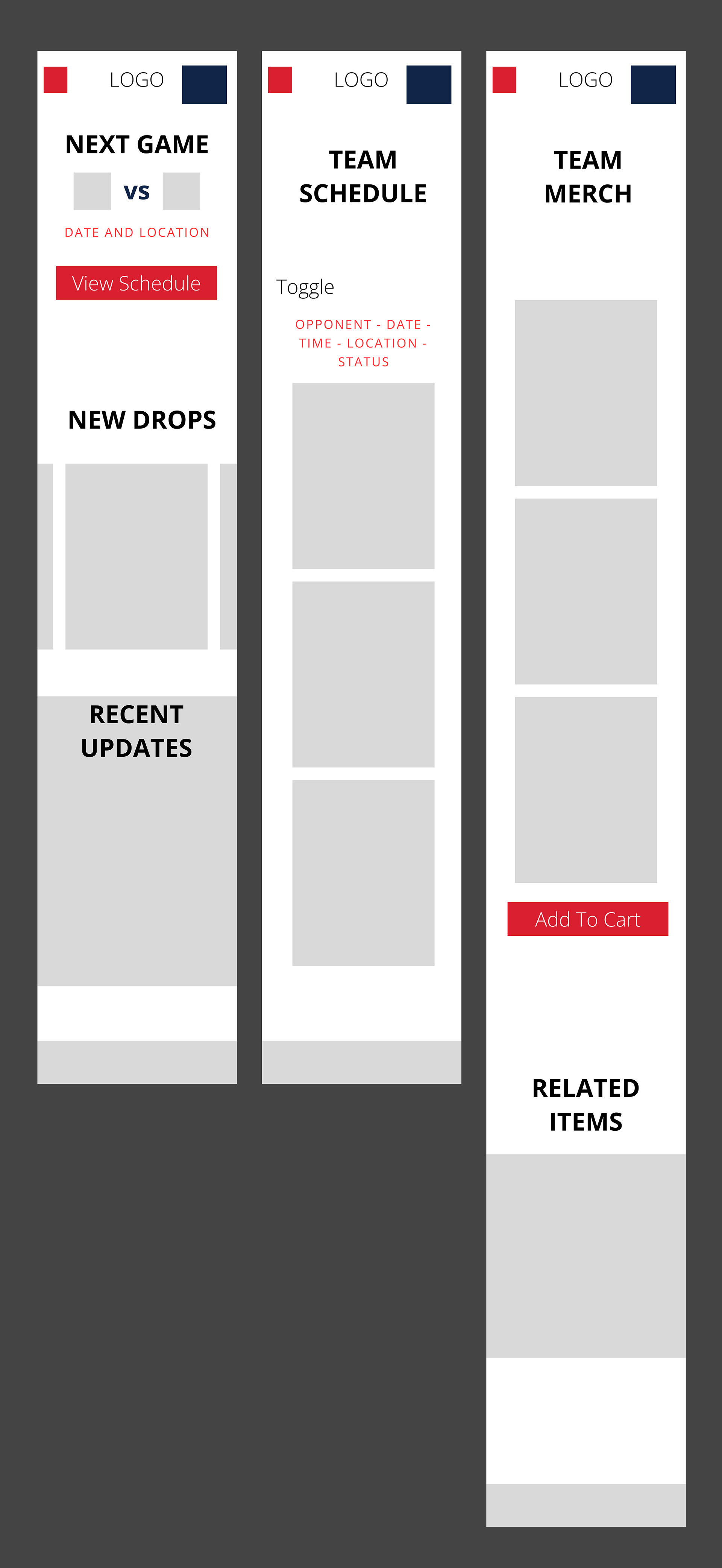
Initial wireframes focused on simplifying access to the two most important features:
1. Game Schedules
2. Merchandise shopping
The layout was designed mobile-first before expanding into desktop responsive layouts.
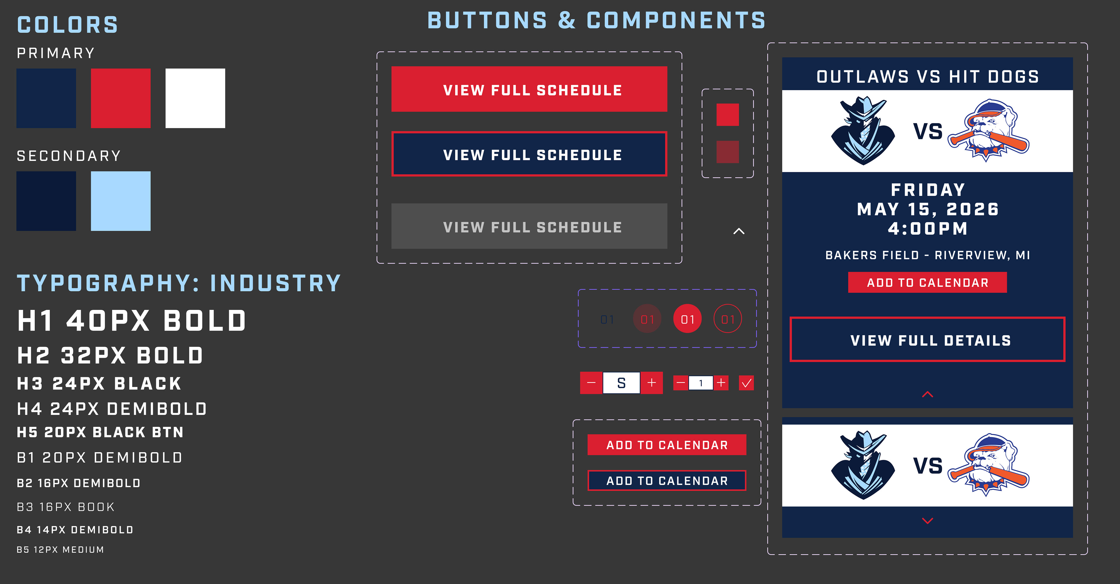
UI Design System
Colors: Navy blue, baseball red and white was chosen to reflect traditional American baseball aesthetics while maintaining contrast and readability.
Typography: Bold sport font is used to help create an authentic stadium-inspired experience.
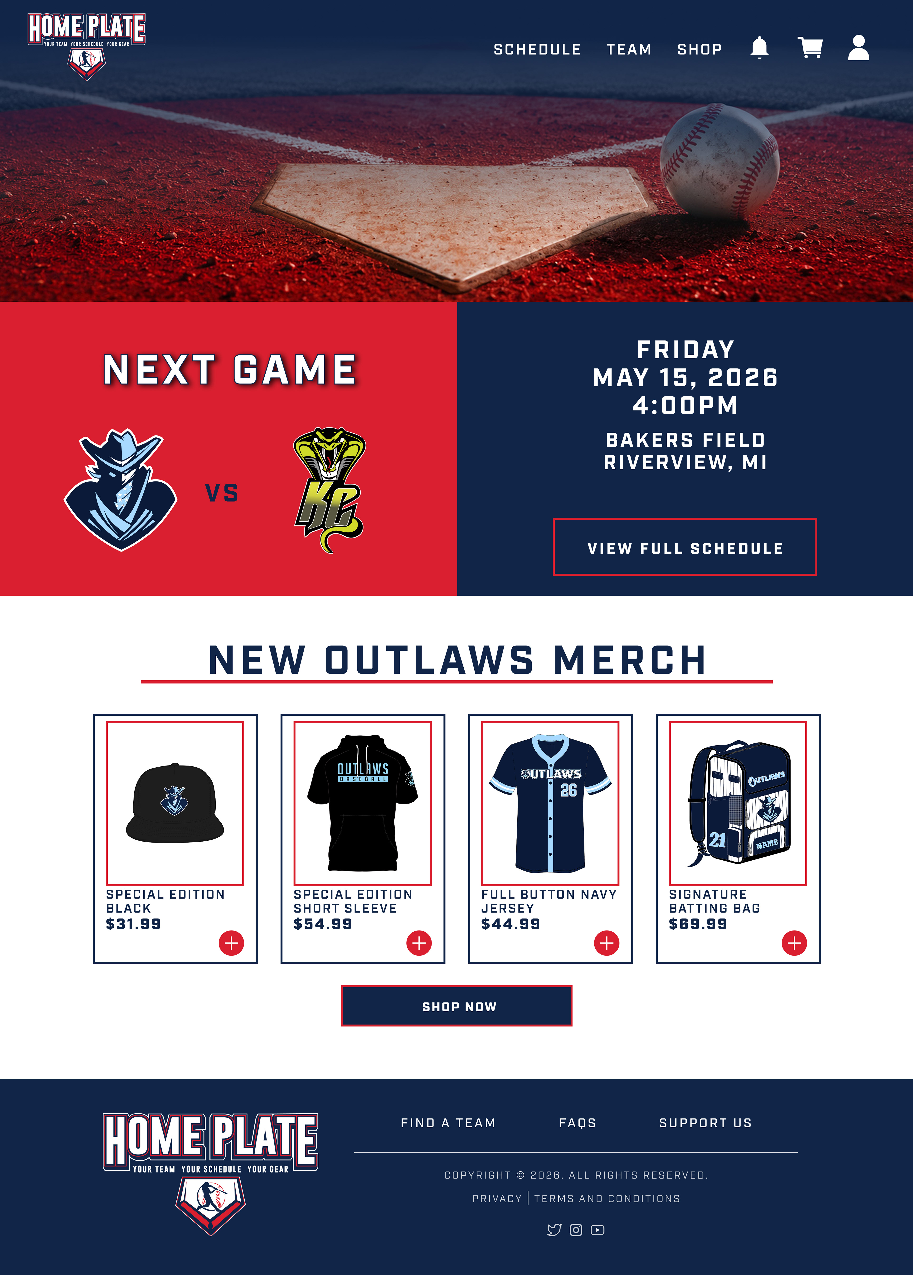
Homepage - Eye catching and immediately addresses the two problems: next upcoming game and team merchandise. Bottom tab navigation was added for mobile to help fast thumb-access to key sections.
Why it works - Simple but helps users quickly see the upcoming game and its details, as well as a merch preview to quickly browse featured products without leaving the homepage.
Schedule Section - Users can virtually browse upcoming games through a simplified monthly calendar or the game cards. Each card shrinks and expands for more details.
Why it works - Focuses on readability, fast scanning, mobile usability, key features, and calendar integration.
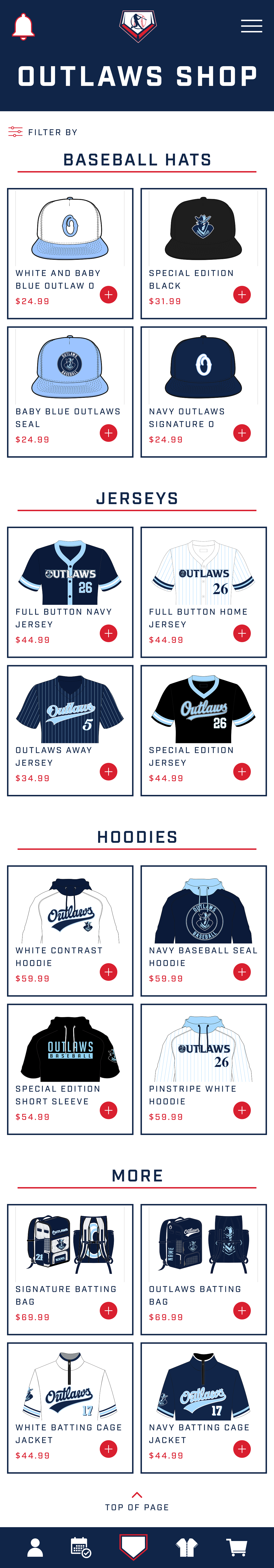
Shop Section - Designed to feel like a real sports merchandise store while remaining lightweight and easy to browse. Products are separated into easy categories.
Why it works - Prioritizes organization and visual balance. The mobile version prioritizes large touch targets, vertical browsing and fast add-to-cart actions.
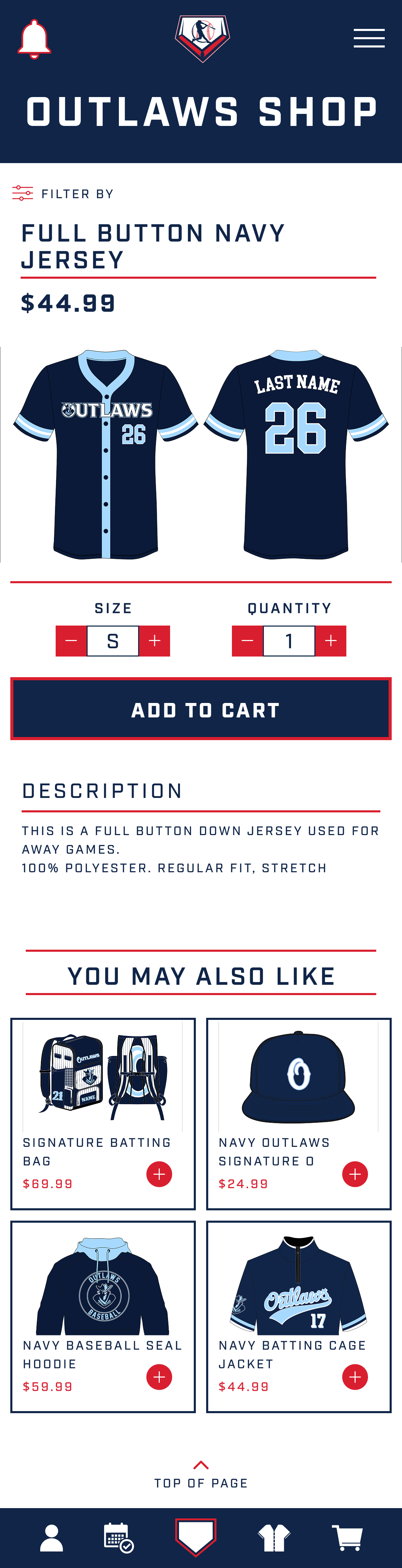
Product Detail Section - Easily shows the product, size and quantity controls, related products, and a CTA add-to-cart button.
Why it works - Keeps purchasing simple, showcases apparel clearly and reduces checkout friction.
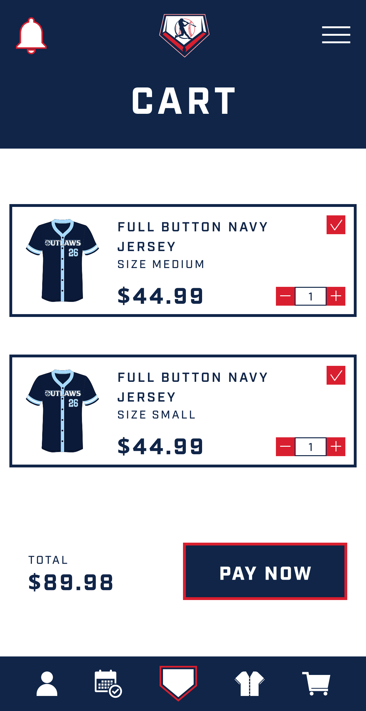
Cart & Checkout section - Shows quick quantity editing, clear pricing hierarchy, and a simple checkout CTA.
Why it works - It is intentionally minimal to reduce distractions and improve conversion.

Sports branding can easily become visually overwhelming. The challenge was creating a bold interface while maintaining structured layouts, clear hierarchy, balance, and readability.
The final result creates a cohesive digital experience that feels modern, energetic, and easy to navigate for both players and supporters.
This project helped strengthen my understanding of E-commerce flows, mobile navigation patterns, visual hierarchy, and component consistency.
Copy/Paste Prototype Link Below:
https://www.figma.com/proto/gyOqaIP3MQIXvXFL477svj/Portfolio?node-id=28-616&viewport=-612%2C899%2C0.25&t=rgV07aE8xHaWW2Yx-1&scaling=min-zoom&content-scaling=fixed&starting-point-node-id=28%3A616&show-proto-sidebar=1&page-id=17%3A1862
